Principles of Design in the Work of Alexander Calder
Alexander Calder is famous for his mobiles and big sculptures, he was a master of applying design principles. Using simple materials like wire, sheet metal and paint he made pieces that were dynamic and fun, he got the basics of design down. His work is often playful and sophisticated, you can see the design elements of balance, movement, rhythm, contrast and unity in his work. This post will look at how these principles are present in his body of work and why he’s a 20th century art icon.
1. Balance: The Core of Calder’s Mobiles
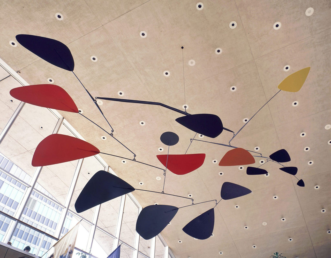
A key element of Calder’s work is balance, especially in his mobiles. These are exercises in balance, physical and visual. Calder’s mobiles have multiple parts suspended in the air, moving with the air currents and staying in balance. Balance isn’t just about weight, it’s visual too. Calder distributes color and form so that no one part dominates. In Untitled (1976) he uses asymmetrical balance where different shapes and sizes come together to make a sense of stability. From any angle you can see that balance in art doesn’t have to be symmetrical to be effective.
Calder expertly distributes weight and color across his compositions, ensuring that no single element overwhelms the others. For example, in pieces like Untitled (1976), Calder uses asymmetrical balance, where the shapes are varied in size and form but are arranged so that the entire composition feels stable and cohesive. This dynamic balance invites the viewer to engage with the work from multiple perspectives, reinforcing the idea that balance in art does not always have to be symmetrical to be effective.
2. Movement: Art in Motion
Movement is another principle of design that Calder worked with, especially in his mobiles. His kinetic sculptures, sometimes called “art in motion” changed modern sculpture by making movement a part of the experience.
Unlike static sculpture, Calder’s mobiles change all the time, their parts gently swaying or spinning in the air. This introduces a temporal element to the work, so the viewer’s experience of the piece is never the same from one moment to the next. The interaction of air, gravity and material in Calder’s work shows how design can use real world forces to create fluidity and life.
In his stabiles—big sculptures on the ground—movement is suggested rather than actual. Though the forms are static, Calder’s use of curves, angles and lines makes you feel like the objects are flying or the wind is blowing through the landscape.
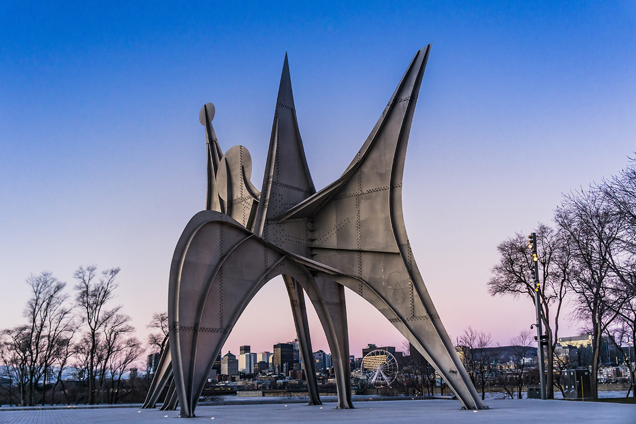
Alexander Calder, Trois Disques, 1967; Jean Drapeau, Montreal, Canada; Photo: Pernelle Voyage - stock.adobe.com
3. Rhythm: Visual Harmony Through Repetition
Calder’s work has rhythm too, particularly with his use of repeating shapes, colors and forms. Rhythm in design is the repetition of visual elements in a way that creates movement and flow in a composition. Calder used simple shapes – circles, triangles, ovals – and repeated them in different sizes and configurations.
In his mobiles the rhythmic arrangement of shapes creates a visual melody as they swing and turn. Your eye moves from one to the next in a continuous flow. This rhythm makes Calder’s work feel organic and alive, as if each piece is part of a bigger self sustaining world of shapes and forms.
4. Contrast: Playing with Opposites
Calder frequently utilized contrast to add visual interest and complexity to his work. Contrast in design can be achieved through differences in color, shape, texture, or scale, and Calder employed all of these methods. In his mobiles, for example, he contrasted bold primary colors with the soft, organic movement of the suspended elements. The juxtaposition of sharp, geometric shapes with the gentle, unpredictable movement creates a tension that keeps the viewer engaged.
In his larger stabiles, Calder often contrasted the massive, heavy forms of the sculptures with the negative space around them. This interaction between solid and void creates a dynamic play of light and shadow, drawing attention to both the object itself and the space it occupies.
5. Unity: Bringing It All Together
Despite the diversity of forms and materials Calder employed, his work is always marked by a strong sense of unity. Unity in design refers to the cohesion of the various elements within a composition, ensuring that all parts work together to create a harmonious whole. Calder achieved this through his consistent use of organic shapes, balanced compositions, and a limited but effective color palette.
In works like La Grande Vitesse (1969), a massive public sculpture in Grand Rapids, Michigan, Calder’s mastery of unity is evident. The piece, with its bold red color and flowing, abstract forms, feels completely integrated with its environment. The unity of form and context allows the work to both stand out and fit in, making it a landmark in both the physical and artistic landscape.
Alexander Calder's work gives a lesson to how principles of design can be applied. Balancing complexities in forms, introducing movement and rhythm, creating contrast, and achieving unity in his sculptures have made an impact on the world of art and design. In this regard, the application of principles in innovative ways, Calder opened possibilities of sculpture and challenged traditional ways of what art could be. It constantly inspires artists and designers, and viewers, reminding us about the power of balance, movement, and harmony in visual art.
Featured Photo: Hanging Mobile by Alexander Calder, 1957; John F. Kennedy International Airport - www.calder.org
That's it for today! If you're interested in more design insights, make sure to check out other posts here on Art+Media+Design.