Color is more than just an visual element; it’s a powerful tool that affects our emotions and perceptions. In art, media and design, understanding the psychology of color can make your work more impactful and connect with your audience more. Below are gathered the principles on how to use color to evolve emotion, set the mood and communicate.
Colors have different meanings and evoke different feelings. Here’s a quick rundown of how some colors are perceived:
- Red: Passion, energy, urgency. Use to grab attention.
- Blue: Calm, trust, professionalism. Common in corporate branding.
- Yellow: Happiness, optimism, creativity. Great for energizing.
- Green: Nature, tranquility, growth. Often used for sustainability.
- Black: Sophistication, power, elegance. Used in luxury branding.
- White: Purity, simplicity, cleanliness. Used to create space and minimalism.
Setting the Mood
When designing something—be it a website, an ad or a painting—think about the mood you want to create. A soft pastel palette will create a calm atmosphere, a bold vibrant color will energize and excite.
Color Combinations
Color is often used in combinations. Here are some examples:
- Monochromatic: Variations of one color creates harmony and unity.
- Analogous: Colors next to each other on the color wheel creates tranquility.
- Complementary: Opposite colors creates contrast and grabs attention.
Case Studies
- Branding: Look at the branding of big companies like Coca-Cola (red for excitement) or Starbucks (green for growth and calm). Each color choice is key to how we perceive them.
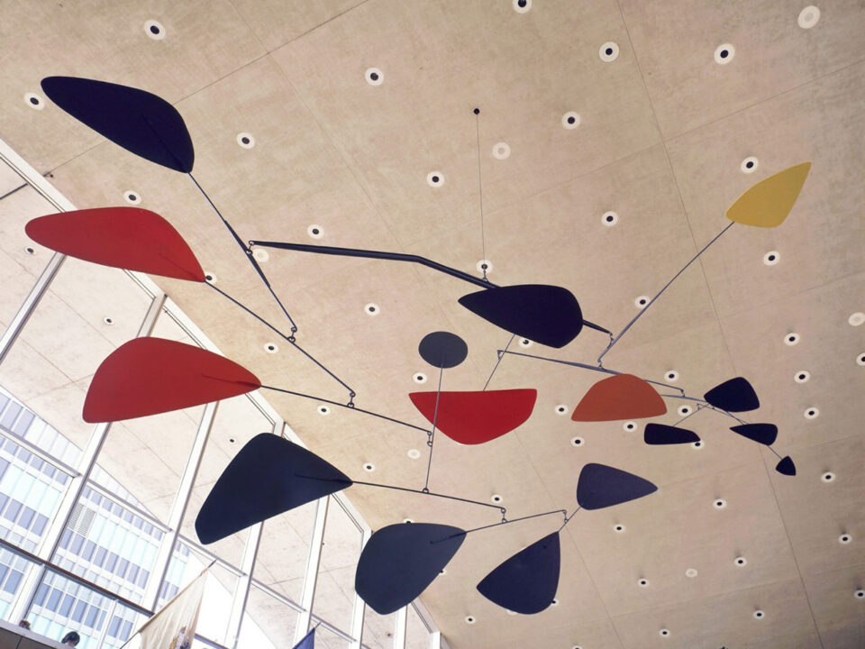
- Art: Artists like Mark Rothko use color to evolve deep emotional responses. His big color-field paintings create an immersive experience that connects on a personal level.
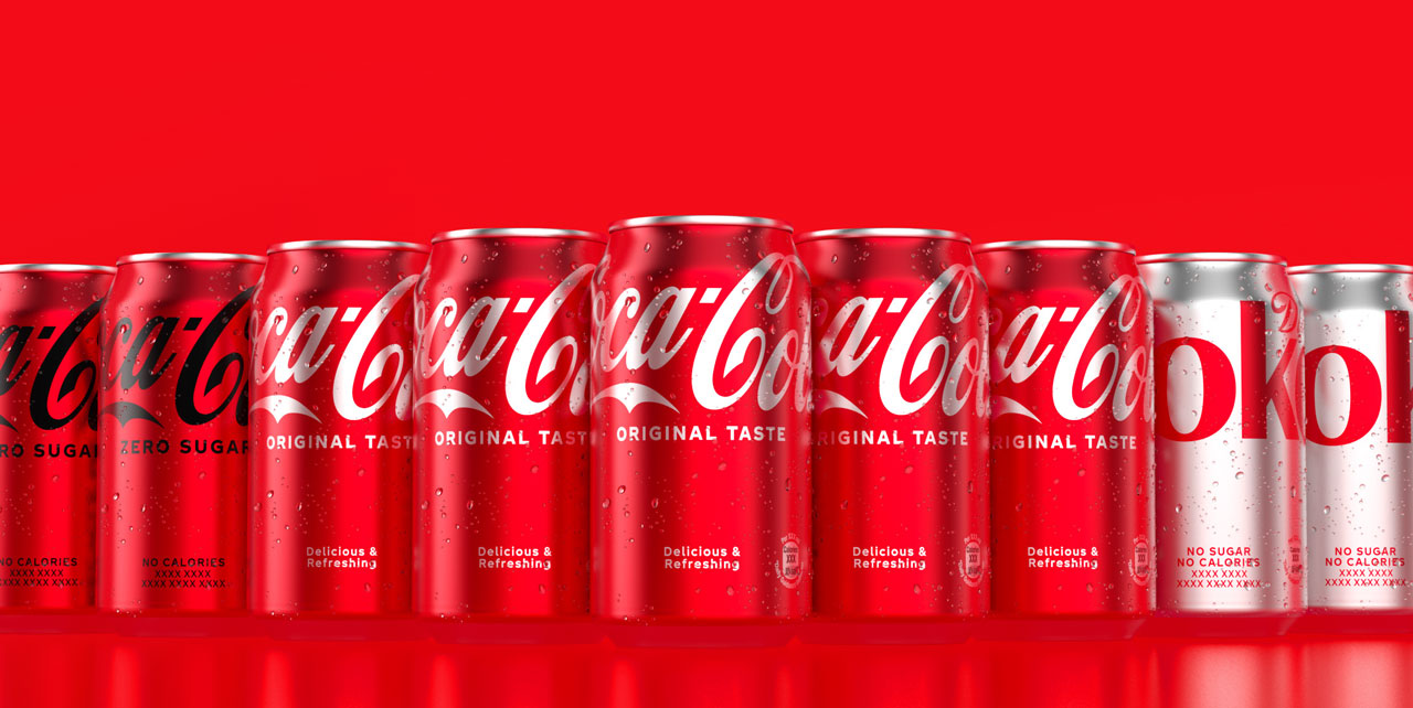
Source: Coca-Cola Icon Design System, September, 2020 — 1.0
Practical Tips for Designers
- Know Your Audience: Research your target audience demographics and tailor your color choices to their preferences and cultural associations.
- Test and Iterate: Use A/B testing for digital designs to see which color schemes work best with your audience.
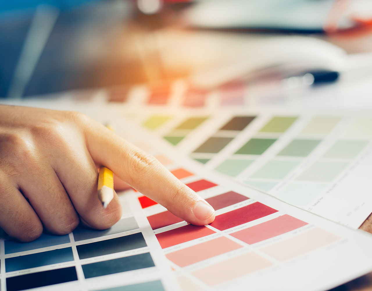
- Stay Informed: Color trends change. Stay up to date with Pantone and design blogs to keep your work current.
Color in art, media and design can make a big difference to the emotional and visual impact of your work. Now, the knowledge of the psychology of color, enables the design not only to look good, but also to make connection with your audience. Next time you start a project, think about how color can tell your story.
That's it for today! If you're interested in more design insights, make sure to check out other posts here on Art+Media+Design.