Herbert Matter, a Swiss-born artist and designer, left a significant mark on the world of graphic design, especially in the realm of logo design. Known for his innovative use of photography and typography, Matter’s design philosophy was rooted in simplicity, clarity, and a deep understanding of visual communication. Let's dive into how he approached logo design and why his work still resonates today.
Who Was Herbert Matter?
Before we explore his process, it’s essential to understand the man behind the designs. Born in 1907, Matter started his career as a photographer and designer in Switzerland before moving to the U.S. in the 1930s. He worked with brands like Knoll, Condé Nast, and The Museum of Modern Art (MoMA), creating timeless logos that are still in use today. His ability to merge typography with imagery set him apart from many of his peers.
Matter’s Logo Design Philosophy
When it came to logo design, Matter emphasized a few core principles:
- Simplicity is Key: For Matter, a logo should be easy to recognize, versatile, and timeless. He avoided over-complicated designs and always looked for the simplest way to communicate the essence of a brand.
- Function Over Ornamentation: Matter believed logos should serve a function. Rather than adding decorative elements, his designs focused on making a strong, clear impression without unnecessary embellishments.
- Typography as Visual Art: Matter had a deep understanding of typography and often used it as the primary element in his logos. He saw type not just as a way to convey information but as an artistic element that could shape a brand's identity.
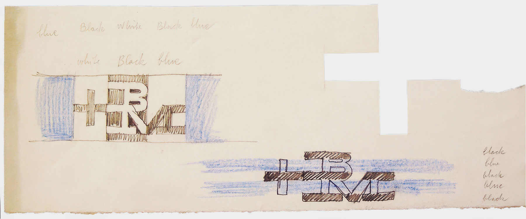
Herbert Matter, Boston and Maine Railroad Logo Development, 1956 - www.herbertmatter.org
The Process: How Did He Do It?
Here’s a breakdown of how Matter typically approached a logo design project:
1. Research and Conceptualization
Matter always began with a deep dive into the company or organization he was designing for. He believed that a logo should reflect the essence of the brand. Understanding the client’s history, mission, and values allowed him to develop a visual concept that was aligned with their identity.
2. Sketching and Prototyping
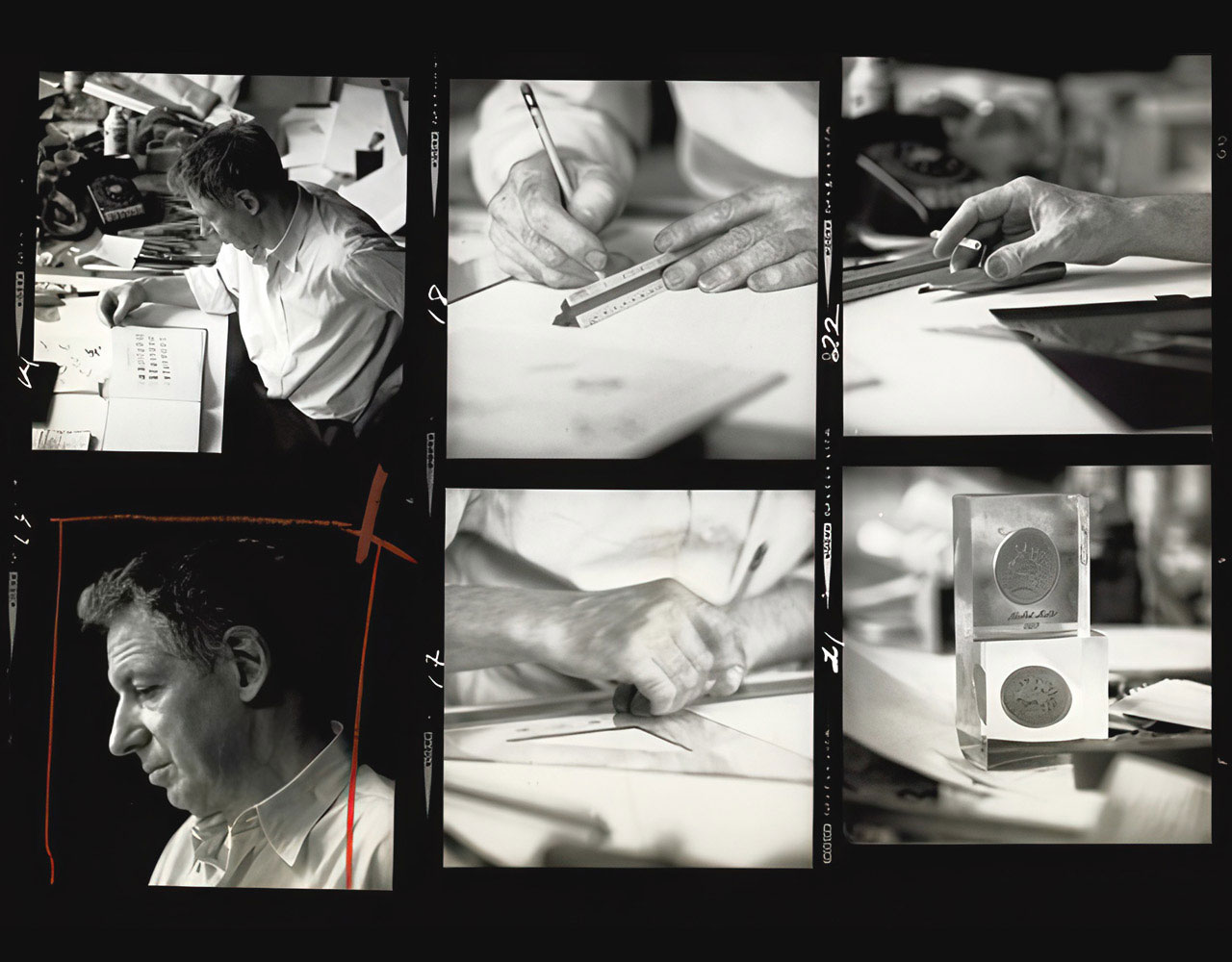
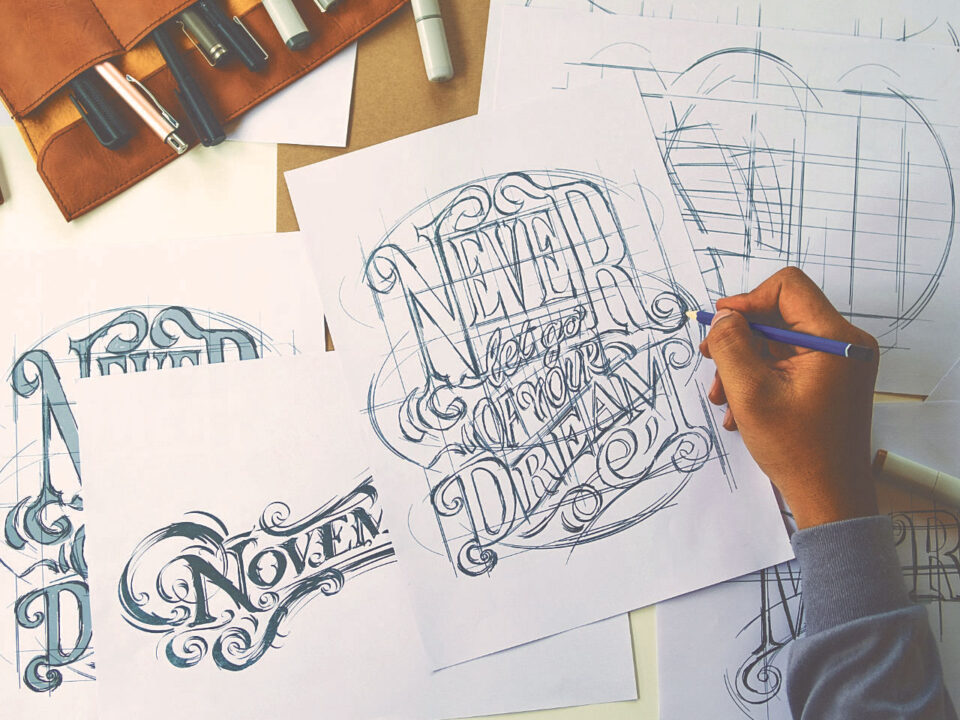
While today’s designers might use digital tools, Matter was known for his hand-drawn sketches. He would sketch out multiple ideas and variations before honing in on a concept that worked. This step was crucial for refining the design and exploring various forms the logo could take.
3. Balancing Type and Image
Many of Matter’s logos, including the famous Knoll logo, showcase his masterful use of type. He often worked with letterforms, transforming them into the design itself rather than relying on separate graphic elements. This marriage of type and image helped his logos achieve a clean, unified look.
4. Iterating and Simplifying
Matter was a firm believer in the phrase, “less is more.” He would iterate on a design, stripping away unnecessary details until only the core elements remained. This resulted in logos that were both minimalist and impactful.
Notable Logos by Herbert Matter
- Knoll International: His logo for Knoll is a standout example of how he used typography to create a strong branding. The simple, bold lettering is timeless and has remained unchanged for decades.
- New Haven Railroad: Matter also created a memorable logo for the New Haven Railroad, utilizing bold, geometric shapes to form the company’s initials.
Why Herbert Matter’s Logos Endure
Matter’s logos endure because of their clarity, timelessness, and ability to communicate a brand's identity in a single glance. His process of distilling a design down to its essentials while maintaining a sense of artistry is a masterclass in the power of simplicity.
So, if you’re ever stuck on a design project, take a page from Herbert Matter’s book: start simple, stay functional, and let the type do the talking.
Herbert Matter's Official Site – herbertmatter.org
That's it for today! If you're interested in more design insights, make sure to check out other posts here on Art+Media+Design.
