For decades, visual identity was reduced to one object: the logo. That view no longer holds.
A logo still matters. It still gives a brand a legal, commercial, and symbolic marker. It helps people name, find, remember, and verify an organization. But in digital environments, recognition rarely starts with a symbol alone. It starts with repeated behavior.
You recognize a publication before you read its masthead. You recognize a platform before you notice its icon. You recognize a brand because its typography, spacing, color, image treatment, motion, and interface logic keep appearing in a consistent way.
This is the real shift, visual identity has moved from object to system.
The strongest identities today do not depend on one perfect mark. They depend on repeatable choices. Typography carries voice. Color builds memory. Layout creates rhythm. Motion teaches behavior. Image direction shapes perception. The logo has not disappeared, but it has lost its monopoly.
Quick Answer: Visual identity without a logo works by shifting recognition from a single mark to a repeatable system. Typography, color, layout, image direction, motion, tone, and interface behavior create familiarity across digital formats. A logo still helps as a legal mark, navigation cue, or brand anchor, but it no longer needs to carry the full identity alone.
Why Logos Break Down in Digital Contexts
Logos were built for controlled environments. They worked well when media formats were limited. A company placed its mark on stationery, signage, packaging, print ads, vehicles, and building facades. The logo appeared at a readable size. The background was controlled. The audience had enough time to see it.
Digital media changed those conditions. A logo now appears inside favicons, app icons, social avatars, email footers, browser tabs, mobile headers, video thumbnails, search results, dark mode layouts, platform previews, and cropped profile images. In those spaces, logos often lose power. They become too small to read, cropped by platform rules, detached from brand context, surrounded by interface clutter, or reproduced in inconsistent color modes.
This does not make logos useless, it makes them insufficient.
In many digital contexts, the logo becomes the least stable part of the identity. The system around it carries more weight. Typography repeats. Layout structure persists. Image behavior stays recognizable. Color relationships return again and again. The audience learns the pattern.
Recognition shifts from the mark to the method. That is why strong digital identities still work when the logo is hidden, reduced, or absent.
Identity Starts Before the Logo Appears
A logo usually appears in a fixed position: top left, footer, app icon, sign-off, avatar. But identity often begins earlier.
It begins in the first second of contact, before the viewer consciously identifies the brand. It begins in the way a headline sits on the page, the amount of space around the content, the crop of an image, the behavior of a button, the rhythm of navigation, or the way a page moves.
These details shape recognition before the viewer names the brand.
This matters because most digital contact happens through fragments. A user might encounter a single article preview, one social post, a product card, a newsletter subject line, a Google result, or an AI-generated summary. In each case, the logo might not carry the message. The identity system must work without depending on it.
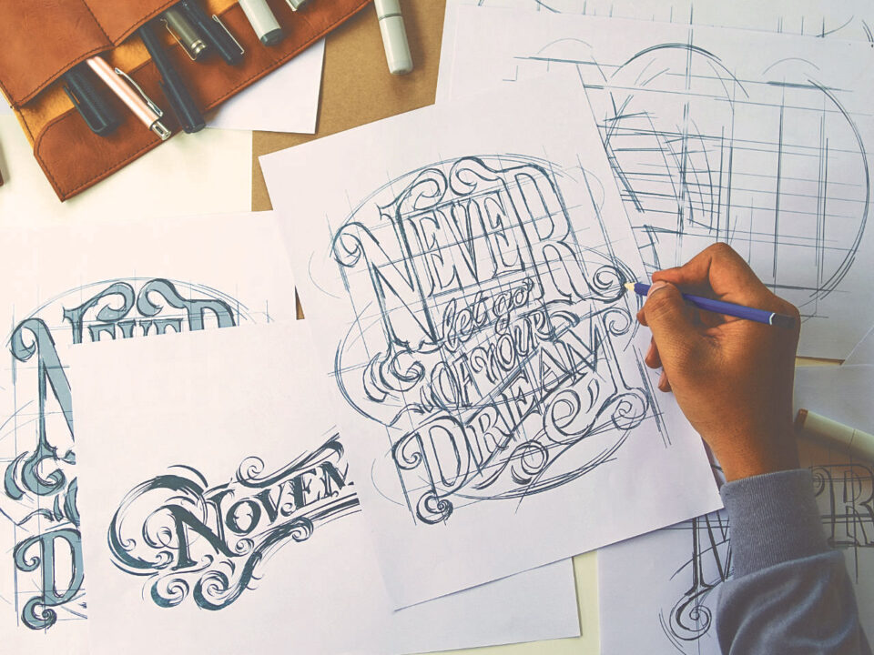
Typography as the Primary Identifier

Letterpress wood type blocks. Author: MarekPhotoDesign.com (stock.adobe.com)
Typography carries voice, a symbol appears once, type speaks across the whole experience.
It appears in headlines, body text, captions, navigation, forms, labels, calls to action, credits, metadata, and error messages. Because it repeats constantly, typography often becomes the most reliable identity signal.
Editorial design has always understood this. Newspapers, journals, magazines, and cultural publications build recognition through headline scale, weight contrast, line length, column rhythm, caption treatment, spacing discipline, and typographic restraint or tension. The masthead matters, but the publication’s identity lives in the page system.
The same logic applies online.
A digital publication with consistent headline proportions, body text rhythm, pull quotes, captions, and article spacing builds recognition even when the logo is not visible. A brand with a clear type system gains a voice that extends across its website, newsletter, social posts, presentations, and product interface.
Typography works because it governs behavior. It decides what the reader sees first. It controls pace. It creates hierarchy. It tells the audience whether the brand feels institutional, experimental, editorial, technical, commercial, or intimate.
A logo names the brand, typography lets the brand speak.
Color Systems and Visual Memory
Color builds memory when it follows rules.
A single color rarely creates identity on its own. Many brands share blue, black, red, green, beige, or white. What separates one identity from another is not the color alone, but the behavior of the color system.
A useful color system defines primary colors, supporting tones, neutrals, accent colors, background logic, contrast rules, and light and dark mode behavior. It also defines when color should appear and when it should stay absent.
That last point matters.
Color gains strength through restraint. If every element competes for attention, the system weakens. If color has clear roles, it becomes easier to remember.
A brand might reserve one accent color for active states and calls to action. A journal might use quiet backgrounds with one recurring highlight color for credits, links, or category labels. A product interface might define color tokens across light and dark themes so the experience stays coherent across devices.
Color also helps identity survive format changes. The logo might change size. The layout might adapt. The image ratio might shift. But if color behavior remains consistent, the audience still senses continuity.
Color should not decorate the identity. It should organize it.
Layout, Grid, and Repetition

Abstract vector geometric pattern, background design in Bauhaus style. Author: Vecarto (stock.adobe.com)
Layout is identity. A grid does more than align objects, it creates expectation.
Margins, columns, gutters, image ratios, caption placement, content widths, and section spacing all teach the viewer how the brand behaves. When those decisions repeat, the audience starts to recognize the system.
This recognition often happens below conscious awareness. The viewer does not think about column structure, spacing ratios, or alignment rules. The viewer simply feels that the experience belongs to the same source.
That feeling comes from repetition.
Strong layout systems define page rhythm, content density, image scale, text-image relationships, section hierarchy, mobile stacking behavior, white space rules, and alignment logic. When those rules hold, different materials still feel connected.
An article, landing page, case study, social post, presentation, and PDF do not need to look identical. They need to follow the same logic.
This distinction matters. Consistency does not mean repetition without thought. It means controlled variation. A flexible system gives designers room to adapt without losing identity.
Motion and Interaction as Brand Signals

UX / UI design process for mobile application and website. Author: InfiniteFlow (stock.adobe.com)
Digital identity also moves. Motion, timing, transitions, hover states, scrolling behavior, loading patterns, and micro-interactions all influence how a brand feels.
A calm institution should not move like an entertainment app. A design journal should not behave like a discount marketplace. A luxury service should not rely on frantic animation. A technical platform should not obscure function with decorative motion.
Motion becomes part of identity when it follows a system. The system determines how fast elements enter, how links respond, how menus open, how images reveal, how forms confirm action, and how much movement the interface allows.
Motion has practical value. It guides attention. It confirms action. It helps users understand structure. But motion also communicates attitude.
Slow fades, sharp cuts, elastic movement, fixed-position elements, parallax, scroll-triggered reveals, and instant transitions all create different impressions. When these choices remain consistent, motion becomes another layer of recognition.
A digital identity without motion rules feels inconsistent fast. A digital identity with motion rules gains depth.
Image Direction Without a Logo
Images often carry more immediate emotional weight than logos. This makes image direction essential in logo-light identity systems.
A brand should define how images behave, not only what images show. Cropping style, subject distance, use of people, color temperature, contrast level, background treatment, image ratios, and the relationship between image and text all shape identity.
For an editorial project, image direction might favor archival material, strong composition, generous captions, and visual context. For a design agency, images might emphasize process, details, typography, interfaces, and finished systems rather than generic office scenes. For an architecture practice, images might rely on proportion, material detail, light, and spatial sequence rather than stock lifestyle imagery.
The goal is not to create a rigid formula. The goal is to remove randomness.
When images follow a shared visual logic, identity remains present even without a mark.
Content Structure as Identity
Corporate report cover. Author: Kitka (stock.adobe.com)
For publications, cultural organizations, institutions, and knowledge-based brands, structure itself becomes part of identity.
Readers and users learn patterns over time. They learn how headlines work, how essays open, where references appear, how captions are written, how information is grouped, and whether the experience favors short analysis, long-form commentary, interviews, case studies, practical guides, or historical context.
This structure creates an editorial and informational signature.
A brand does not become recognizable only because of how it looks. It also becomes recognizable because of how it explains, orders, and presents ideas. A consistent structure helps people understand what kind of attention the brand expects from them.
This applies beyond publishing. A professional service firm, museum, nonprofit, software product, or educational platform all benefit from recognizable content behavior. The visual system and the content system should support each other.
What Replaces the Logo?
Nothing replaces the logo one-to-one. A better question is: what shares the work of recognition?
In a contemporary identity system, recognition comes from a group of connected signals. The logo or wordmark remains one signal, but typography, color, grid, spacing, image direction, motion behavior, tone of voice, interface patterns, content structure, and repetition across formats all carry part of the identity.
This creates stronger brands.
If one element fails, the system still holds. If the logo appears small, the typography helps. If color shifts in dark mode, layout helps. If an article appears in a feed, the headline structure helps. If a social preview crops the image, the caption style and type treatment help.
Identity becomes more resilient because it does not depend on one element alone.
Where Logo-Free Systems Work Best
Logo-light and logo-free systems work best when audiences encounter the brand repeatedly over time.
They work especially well for digital publications, cultural institutions, museums, universities, design studios, software products, research organizations, architecture practices, and content-driven brands. These environments allow identity to accumulate.
A reader returns. A user moves through screens. A visitor sees repeated posts. A client reviews multiple case studies. The system earns recognition through use.
This is where logo-free identity becomes practical. It does not demand instant recognition from a single glance. It builds recognition through repeated contact.
Where Logo-Free Systems Fail
Logo-free identity is not universal, it fails when immediate identification matters more than accumulated recognition.
Airports, emergency systems, transportation networks, product packaging, app stores, legal trademarks, physical wayfinding, retail shelves, vehicle markings, and regulated products still need strong symbols. In these contexts, the audience needs speed. A symbol helps people identify, choose, avoid, locate, or trust something in a crowded environment.
This is why the argument is not anti-logo.
The issue is hierarchy. A logo should serve the system. It should not replace the system.
When a Logo Still Makes Sense
A logo still makes sense when it has a job to do. It works as a legal mark, commercial identifier, navigation cue, social avatar, product badge, shorthand symbol, and entry point into the brand system.
Problems start when the logo gets treated as the identity itself.
A logo without a system has limited range. It might look good on a presentation slide and fail everywhere else. It might work in black on white but collapse in a mobile header. It might feel polished but give no guidance for typography, color, photography, layout, motion, or content.
A logo does not solve those problems. A system does.
The best logos sit inside strong identity systems. They do not fight the system. They do not demand attention in every context. They help organize recognition.
Lessons from Design History
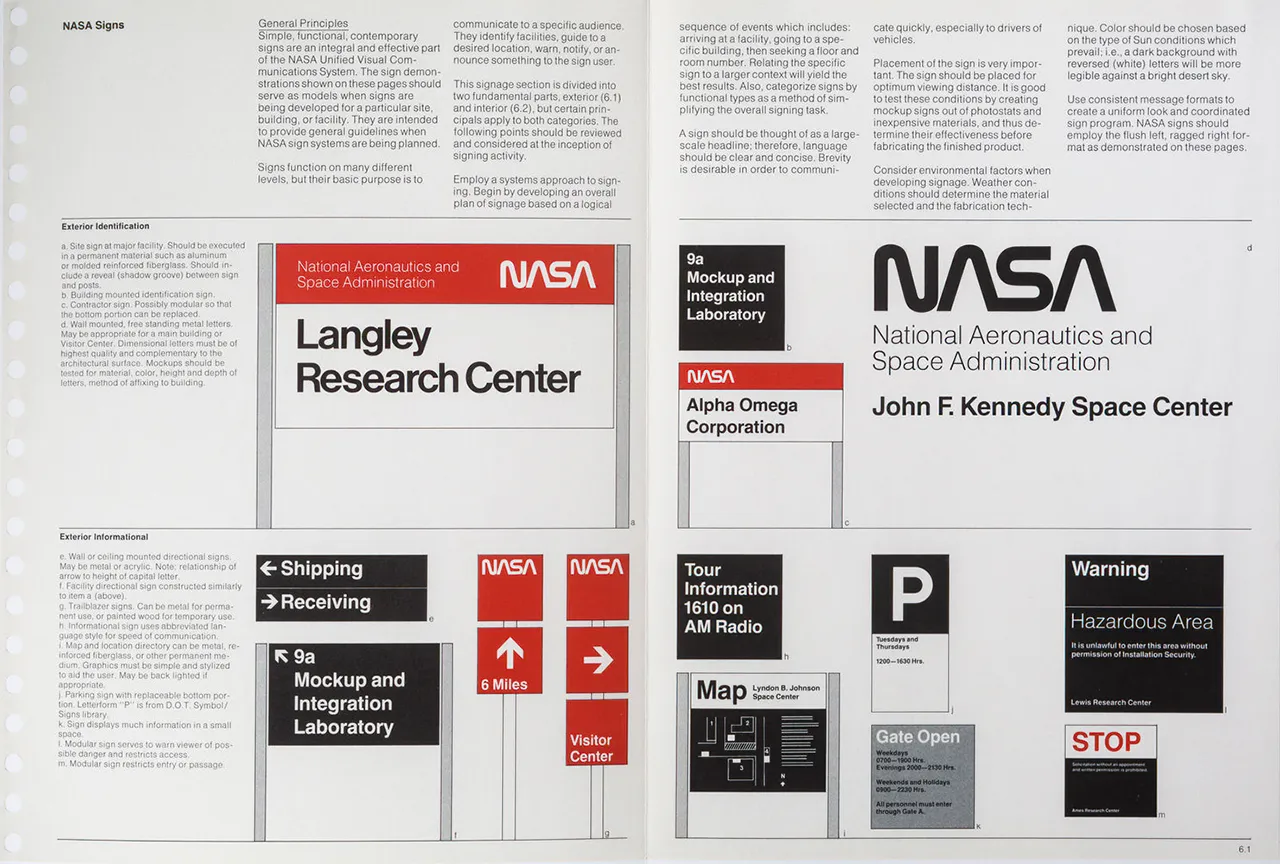
NASA Graphics Standards Manual: Designed by Richard Danne and Bruce Blackburn, Danne & Blackburn, 1975. Book photography: Brian Kelley
The move beyond the logo does not reject design history, it extends it.
Mid-century identity programs already understood systems. The best standards manuals did not only show a logo. They specified typography, spacing, color, placement, vehicles, signage, printed materials, and environmental use.
The NASA Graphics Standards Manual remains a strong example because it treated identity as a coordinated visual program, not a standalone emblem. Herbert Matter and the art of logo design also shows how logos gain strength when a mark connects to typography, composition, proportion, and repeated application.
The difference today is scale.
Identity systems now operate across hundreds of small, unstable, and automated contexts. A brand must survive social previews, search snippets, CMS templates, email clients, mobile screens, dark mode, AI summaries, and third-party platforms.
This makes system thinking more important, not less.
A Practical Test
A brand does not need to abandon its logo to think beyond it. A simple test helps: remove the logo from a website, article, PDF, social post, newsletter, or presentation. Then ask whether the material still feels connected to the same source.
If the answer is no, the logo is doing too much work.
A strong identity should still be recognizable through typography, spacing, color behavior, image direction, content structure, and interaction patterns. It should feel coherent even before the viewer sees the mark.
That does not mean every element should look the same. It means each element should follow the same logic.
Identity as Behavior, Not Object
Visual identity now lives in behavior. Typography establishes voice, color builds memory, layout governs rhythm, images shape perception, motion defines feel, and repetition builds trust.
The logo assists. It does not lead every moment.
The strongest identities behave consistently before they are consciously recognized. They do not depend on one symbol to explain themselves. They create familiarity through structure. They build recognition through use. They endure because the system holds.
Can a brand have a visual identity without a logo?
Why are logos less dominant in digital identity?
What replaces a logo in a logo-free identity system?
When does a logo still matter?
What types of brands benefit from logo-light identity systems?
Continue Exploring Art, Media, and Design
Art+Media+Design is an editorial journal for artists, designers, and thinkers examining how visual culture evolves across media, technology, and time.
If this perspective resonates, explore the journal further. Each article builds on the last, forming a broader conversation about systems, authorship, and creative practice.