How a white-box condominium became a richly layered Boston home through classical order, Art Deco references, and a collaboration in which architecture and interior design became inseparable.
On the thirty-ninth floor of One Dalton, Boston enters every room. The curved glass walls gather the skyline, the Charles River, and the changing light into a continuous panorama. It is the kind of view that can make architecture seem almost unnecessary. Yet a view alone does not create a home.
That was the central challenge facing Pauli & Uribe Architects and W.R. Schroeder Interiors when they began work on a newly completed three-bedroom condominium inside the Four Seasons Private Residences. The apartment arrived as a polished white box: open, angular, and visually dominated by the city beyond its windows. The commission was not to decorate that blankness, but to give it order, intimacy, and a sense of personal history.
The resulting One Dalton Street Residence is a study in transformation. Classical symmetry was introduced into a contemporary high-rise plan. Art Deco references were layered into rooms shaped by modern glass and steel. Art, antiques, custom millwork, reflective surfaces, and carefully framed views were composed into a home that feels collected rather than installed.
A Difficult Kind of Blank Canvas
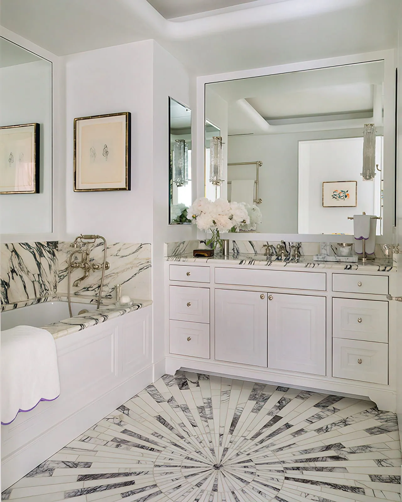
A radial marble floor responds to the geometry of One Dalton’s tower while giving the primary bathroom a strong visual center. Photo: Sarah Winchester.
A white-box apartment suggests freedom, but it also removes the architectural cues that help a room feel settled. There may be generous dimensions and expensive finishes, yet little hierarchy between arrival and retreat, public and private space, foreground and distance. At One Dalton, the problem was intensified by the tower itself.
Designed by Henry N. Cobb of Pei Cobb Freed & Partners in collaboration with CambridgeSeven, One Dalton rises as a soft triangle with curved corners. That geometry produces exceptional views, but it also creates angles that resist the easy symmetry of a traditional room. Rather than conceal the building’s form, the design team used it as a governing idea.
Wood flooring follows the tower’s radial geometry. Flush thresholds define individual rooms without interrupting the larger visual pattern. In the primary bathroom, marble radiates outward in another interpretation of the building’s triangular plan. These gestures do more than create decorative motifs. They allow the interior to acknowledge the architecture that contains it.
The View Was Only the Beginning
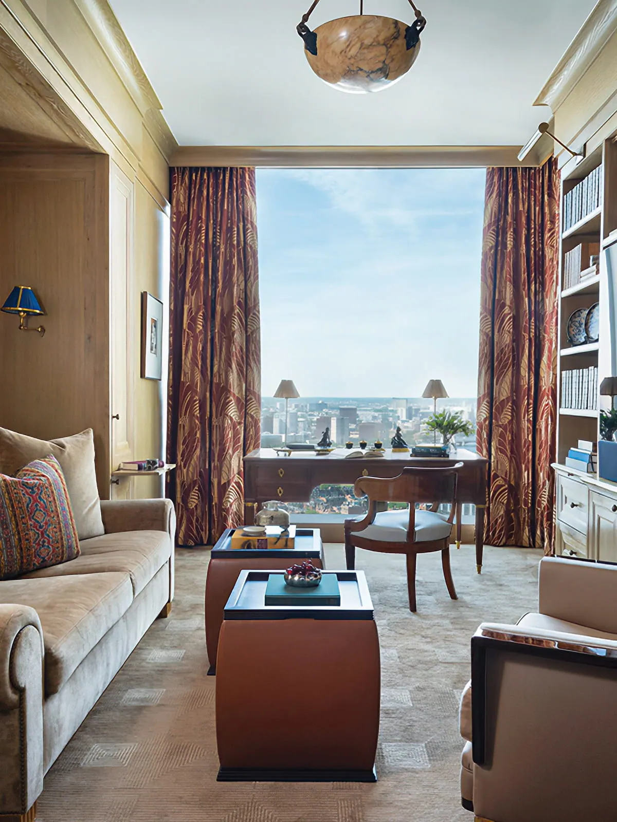
Built-in bookcases and tailored furnishings frame the city view, creating a layered sense of foreground, interior, and skyline. Photo: Sarah Winchester.
Floor-to-ceiling glass can make a residence feel expansive, but it can also flatten the interior experience. When every room is oriented toward the horizon, the eye has little reason to pause inside the home. Architect Juan Guillermo Uribe Rubio described the need to create interest in the foreground, middle ground, and background. That principle became one of the project’s most important design tools.
The skyline remains present, but it is rarely encountered without an architectural frame. Drapery softens the window walls. Furniture establishes smaller fields of attention. Paneling, artwork, mirrors, and doorways create layers between the occupant and the city. The view becomes part of the composition rather than the composition itself.
This shift is subtle but essential. Luxury high-rise interiors often rely on height, openness, and spectacle. Here, the stronger achievement is enclosure. Rooms feel defined without becoming closed off, and the apartment acquires the reassuring sense that each space has a particular purpose and emotional register.
Architecture Before Decoration
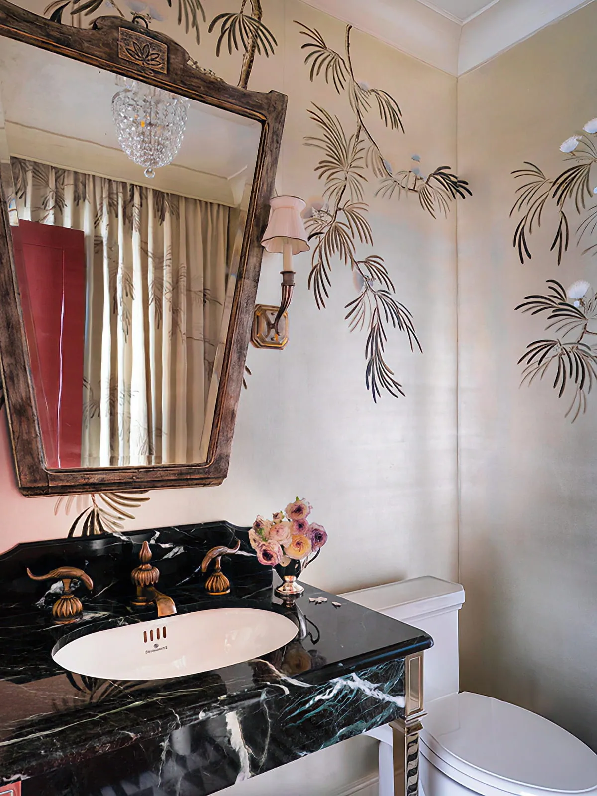
Botanical wallcovering, black marble, polished metal, and a sculptural mirror turn the powder room into a richly detailed interior moment. Photo: Sarah Winchester.
The most consequential interventions are not always the most immediately visible. At the entry, utilitarian doors serving closets and laundry were concealed within a more composed architectural envelope. Areas were opened or closed according to the homeowner’s routines. The kitchen peninsula was reshaped to improve the relationship between the room and its view. Window frames and sills were painted and clad in wood so that the glass perimeter felt warmer and more integrated with the interior.
Elsewhere, a guest bathroom was rearranged so that an open doorway reveals a marble vanity and vintage mirror rather than a toilet. In the side hall, the discovery of additional space above the original ceiling allowed the team to raise it by approximately one foot and create a gilded trough vault. A large closet was removed from the den to make room for an oak-paneled niche and sleeper sofa, turning a secondary room into one of the apartment’s most intimate destinations.
These decisions explain why the One Dalton Street Residence is fundamentally an architectural project. The transformation depends on circulation, proportion, thresholds, sightlines, and the construction of visual hierarchy. Decorative richness follows, but it rests on a plan that has been reconsidered at every scale.
A Parisian Language, Reworked for Boston
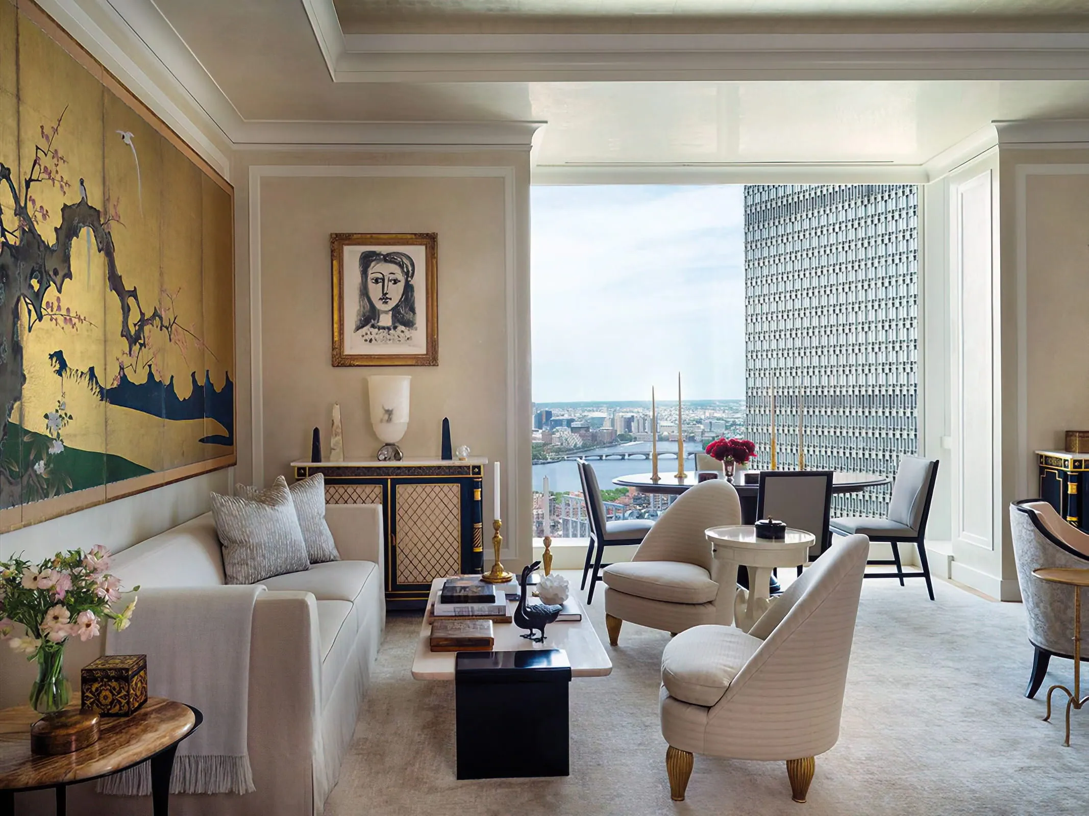
The Boston skyline becomes part of the composition, balanced by layered artwork, furnishings, and architectural detail. Photo: Sarah Winchester.
The apartment’s atmosphere draws from early twentieth-century Paris, especially the cultivated salons of the interwar period. Interior designer William Schroeder looked to figures such as Marie-Laure de Noailles and Yves Saint Laurent, whose homes brought art, furniture, fashion, and personal history into unusually dense conversation.
At One Dalton, those references are present without turning the residence into a period reconstruction. Gold- and silver-leaf ceilings catch light above contemporary rooms. Oxblood lacquer gives the hall the intensity of a cabinet interior. Venetian plaster, hand-painted de Gournay panels, a carved limestone mantel, oak paneling, and marble floors establish distinct material identities from room to room.
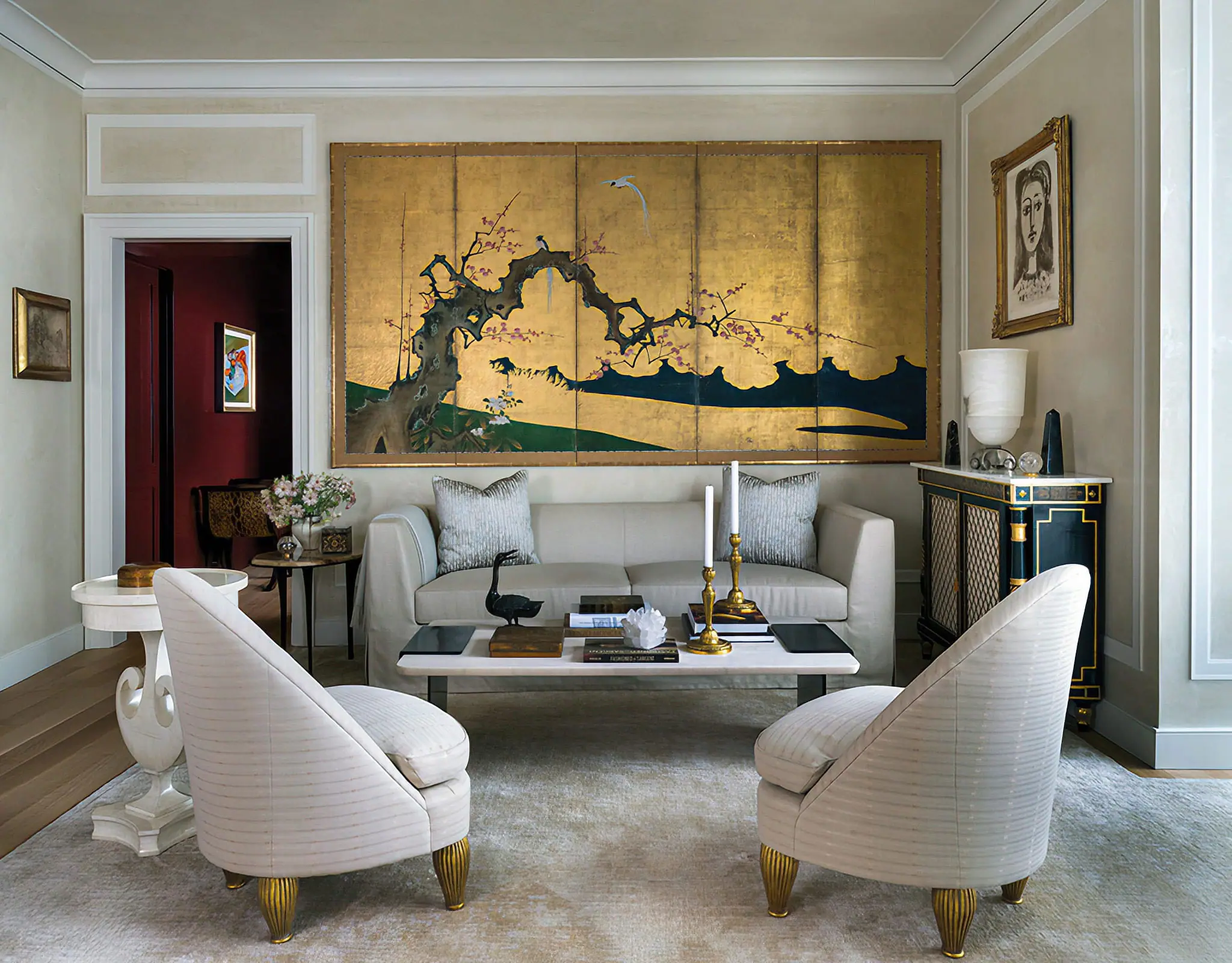
The owner’s collection provides the emotional center. A Henri Lebasque painting occupies the living-room mantel. A Picasso portrait commands another wall. Paintings by the homeowner’s late mother appear throughout the apartment, giving the rooms a private continuity that no purchased collection could replicate. Antiques and objects associated with Karl Lagerfeld and Hubert de Givenchy add another layer of provenance, but they do not overpower the personal material already present.
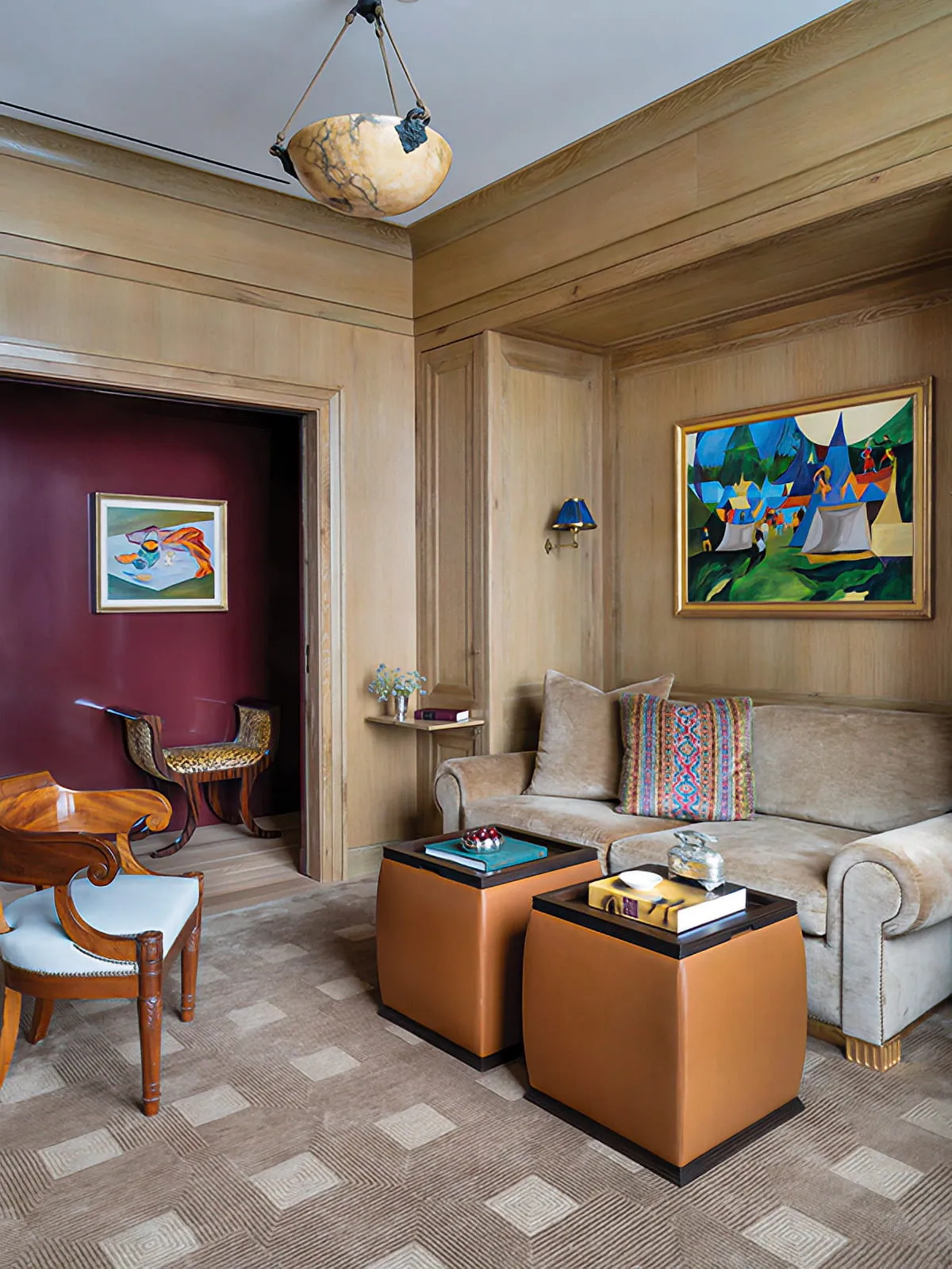
Wood paneling, custom seating, artwork, and deep color bring warmth and character to this compact sitting room. Photo: Sarah Winchester.
The result is not minimal, and it does not attempt to be. Its discipline comes from placement, balance, and repetition. Reflective surfaces expand depth. Gold appears as a recurring note rather than a single flourish. Red moves from the lacquered hallway into patterned drapery and adjoining rooms. The home is richly furnished, yet its strongest effects remain architectural.
The House Is in the Transitions
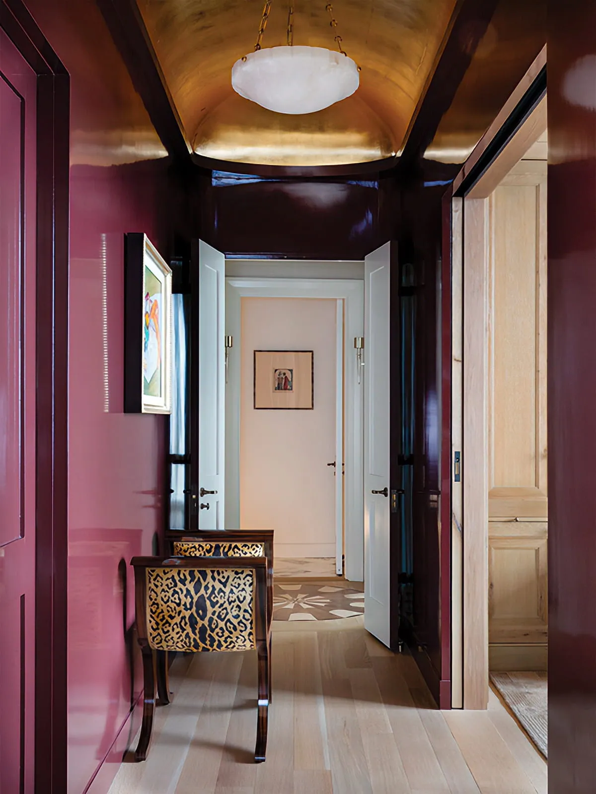
Rich burgundy walls, geometric flooring, and dark ceiling beams transform a circulation space into a carefully staged architectural passage. Photo: Sarah Winchester.
One of the pleasures of the residence is the way it unfolds. The dramatic hall is not simply a passage between rooms. Its raised ceiling, gilded vault, oxblood walls, and patterned floor create a moment of compression and intensity before the apartment opens again toward the city.
The study operates in the opposite register. Newly installed pocket doors reveal a room wrapped in carefully selected oak, with a custom sofa built into the millwork. Shelves beside the seating can hold a book, a vase, or a glass of wine. It is a small detail, but one that captures the project’s method: daily habits are translated into architecture rather than treated as accessories to it.
Even the floors carry narrative. A circular wood medallion in the hall refers to the homeowner’s love of sailing, while a related motif appears in marble in the primary bath. These repetitions connect spaces that otherwise differ strongly in color and material. They also turn movement through the apartment into a sequence of recognition and surprise.
Good residential architecture often reveals itself in such transitions. A room may be memorable, but the path toward it determines how that room is understood. At One Dalton, doors, thresholds, reflected views, ceiling changes, and shifts in material make circulation part of the experience.
Collaboration Without a Visible Seam
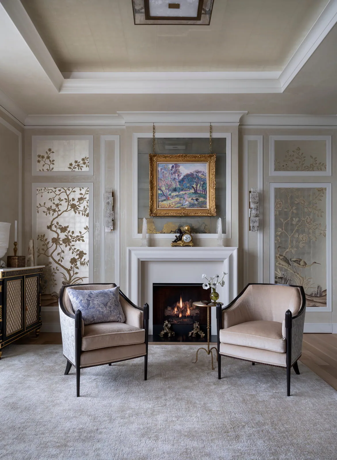
Paneled walls, decorative glass doors, and a marble fireplace create an intimate sitting area within the larger residence. Photo: Sarah Winchester.
The project is also a persuasive example of what can happen when architecture and interior design are developed together rather than in sequence. Pauli & Uribe Architects did not simply prepare a container for furnishings, and W.R. Schroeder Interiors did not arrive after the architectural decisions had been settled. The plan, millwork, materials, furniture, lighting, artwork, and views were considered as parts of the same composition.
That integrated process is especially visible in the living room. A classical limestone mantel establishes the room’s center, while mirrored backing, hand-painted wall panels, artwork, furniture, and a Japanese screen build depth around it. The architectural frame and decorative content are difficult to separate because each was designed to strengthen the other.
For Juan Guillermo Uribe Rubio, whose work includes historic Boston townhouses, high-rise residences, interior architecture, and detailed construction coordination, the project brought several strands of practice together. Classical order could be introduced without denying the modern tower. Contemporary systems and existing constraints could be absorbed into rooms that feel crafted, not technical.
The residence received the 2025 ICAA New England Bulfinch Award in the Townhouse & Apartments category. The recognition is fitting, but the project’s deeper value is methodological. Its richness comes not from a single signature gesture, but from sustained agreement among architect, interior designer, builder, craftspeople, and client.
A Home That Could Belong to Only One Person
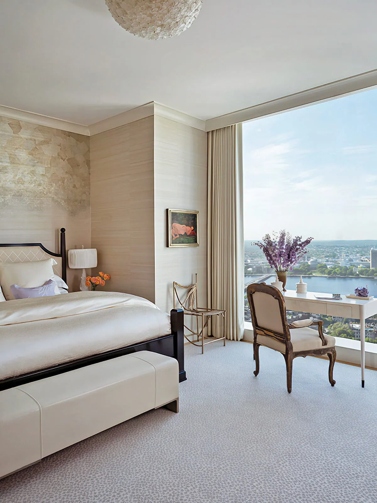
Soft finishes, restrained detailing, and expansive views give the bedroom a quieter, more personal character. Photo: Sarah Winchester.
The most successful luxury interiors are not defined by cost or rarity. They are defined by specificity. They make clear that someone lives there, notices particular things, and has chosen one set of relationships over countless alternatives.
At One Dalton, the homeowner’s art, memories, love of sailing, and willingness to grant the design team unusual creative freedom gave the project its direction. Pauli & Uribe Architects and W.R. Schroeder Interiors answered that freedom with structure. They transformed openness into sequence, angularity into order, and panoramic glass into rooms with weight and intimacy.
The apartment remains unmistakably part of a contemporary Boston tower, yet it also feels removed from the generic language of high-rise living. Classical symmetry and Art Deco references do not function as nostalgia. They provide a framework through which modern architecture, personal collections, and everyday rituals can coexist.
That is the real transformation. The project did not merely fill a blank space above the city. It gave the space memory, character, and a point of view of its own.
Project Credits
Architecture: Pauli & Uribe Architects
Interior design: W.R. Schroeder Interiors
Builder: Cafco
Photography: Sarah Winchester
Building architecture: Henry N. Cobb, Pei Cobb Freed & Partners, with CambridgeSeven
Location: Boston, Massachusetts
Recognition: 2025 ICAA New England Bulfinch Award, Townhouse & Apartments
Sources and Further Reading
- Classic Transformation – Fine Homebuilding / New Old House
- Elegant Living at One Dalton – New England Home
- One Dalton Street Residence, Boston, MA – Pauli & Uribe Architects
- Architecture – Four Seasons Private Residences One Dalton Street
- 2025 Bulfinch Award Winners – ICAA New England